Column 80
We all know that code lines shouldn’t be too long, and many of us use the default value of 80 columns as a (flexible) limit. But do you know why it is precisely 80, and not 60 or 120?
First, we think of a classical computer terminal with 80 columns and 25 lines.
But why did these terminals only have 80 columns?
Table of Contents
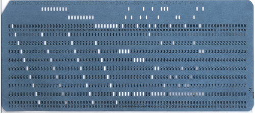
IBM 80-column punched card
The original limitation of text-based terminals is the legacy of

An ~90 years-old size restriction of a paper punch card still dictates today the size of character interface defaults, like the command prompt of Windows, or IDEs and linters using column 80 as the default indicator for acceptable line lengths.
Is it time for a change?
Human Visual Perception
To find an optimal length for our code or texts, we have to let go of thinking solely in computer terms and more in the broader way of how humans perceive visual information and what tools we got: our eyes.
Reading longer lines means more eye movement to focus on the text, putting more strain on our eyes. There’s a reason why most books aren’t DIN A4 or US Letter format. And newspapers and magazines are usually using a multi-column layout.
Reading code
Software development is not only about writing code, but it’s also about reading code, maybe even more than actually writing it.
It’s about one developer communicating with another one. Going over code, especially not our own, like in a code review, should be a pleasant thing to do. And not feel like a chore and exhaust our minds more than needed.
If we encounter an outlier in column length, we have to jump to the end and back, maybe even scroll, which disrupts the reading flow and makes it harder to focus. Seeing the whole picture at one glance is important, or we might miss the subtle differences in column 212 of the code, which might lead to a bug.
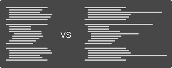
By replacing actual code with bars, we can visualize the flow of code.

Which one would you prefer to read?
Some of the flow depends on the coding guidelines you and your team prefer. But the general idea behind more uniform code blocks without outliers should be clearly visible.
Hard To Read By Design
We should use coding guidelines to ensure the visual perception of our code won’t differ between files, projects, or teammates. Some languages like Golang provide enforced guidelines via tooling. Other languages are more open to an interpretation of what good code styling means.
Python, for example, has PEP-8, its style guide, recommending 79 characters as the maximum line length. Java doesn’t have an official one, but Google recommends a line length of 100 in its guidelines.
At my company, we sat down with all developers and went through different style guidelines, and developed our own subset by discussion and democratic voting on rules. Starting with an established guideline for your language of choice, like AirBnb for JavaScript, is a good idea because other people thought a lot about the problem of proper code styling, and you could use it as a base for your own, maybe even use it without changes.
The disadvantage of having strictly enforced coding guidelines is that deviating from them might be a hard thing to do. Readability may suffer under certain circumstances with too strict guidelines, and our tooling will enforce it.
As reading code shouldn’t be a chore, writing it shouldn’t be a chore, too! These are guidelines, not 100% fixed rules for eternity! If we find ourselves disabling the formatter or linter way too often on particular constructs, we need to rethink our guidelines. They exist to improve our code, for reading AND writing, not force our code to adapt to just make a linter happy.
Know when to break or change the rules, our style guidelines have to evolve and adapt, as we need to do.
Long or short?
So, what’s the magic number for column length?
Longer lines are better for scanning, and shorter lines are better for comprehension (Ling, J., & Van Schaik, P. (2006). The influence of font type and line length on visual search and information retrieval in web pages. International Journal of Human-Computer Studies, 64(5), 395–404).
My personal sweet spot is around 110 characters per line because it’s not too short for every other line to need to wrap around in more verbose languages, and not too long to be unreadable.
You and your team need to find your own preferred length. It all depends on the languages chosen, the tools used, and event the monitor you’re using. Experiment a little before settling down, and remember: guidelines are allowed to change.
