Introduction to CSS Custom Properties
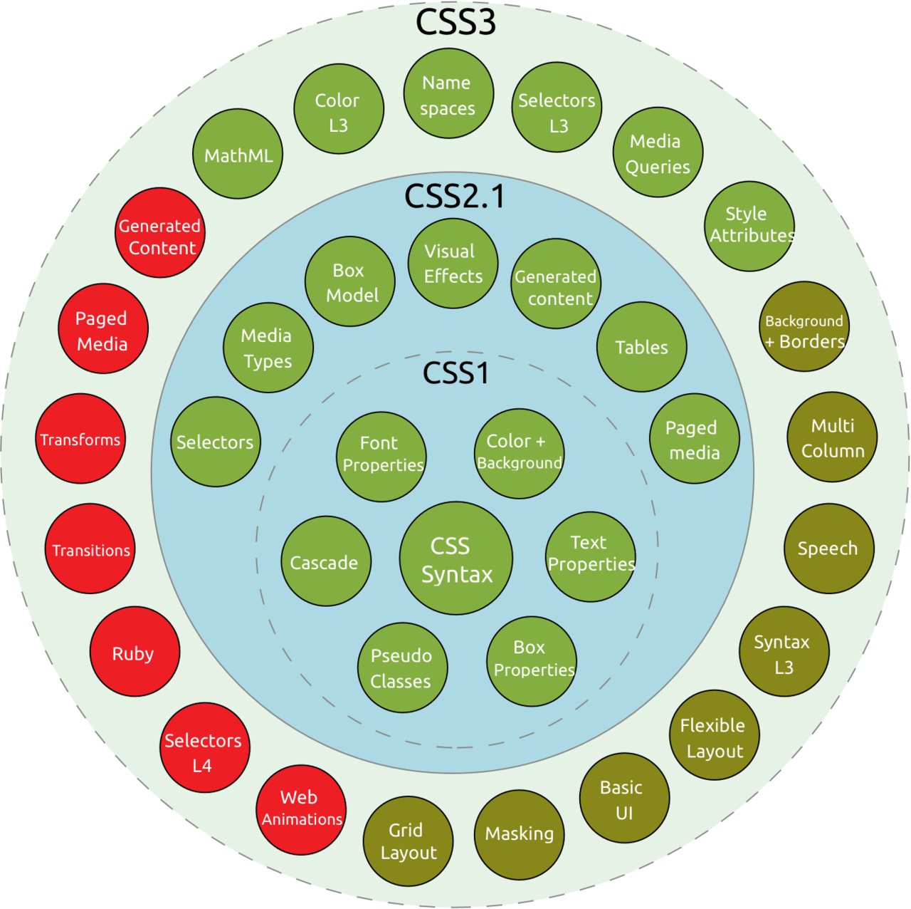
Since its proposition in 1994 and its initial release in 1996 at CERN, the cradle of the Web, Cascading Style Sheets (CSS) evolved from a static description of simple styles to a cornerstone of modern web design.
Table of Contents
A Brief History Lesson
Even back in 1996, the concept of style sheets wasn’t a new idea. They existed in some capacity since Standard Generalized Markup Language (SGML), but they weren’t used for the web. The feature-set was quite limited compared to today:
- Colors
- Font properties and typefaces
- Text properties (e.g., word/letter spacing)
- Edge-related properties (e.g., margin, padding, borders)
- Alignment
Its real first successor, CSS 2.1, became a W3C Candidate Recommendation in 2004. After seven more years, it finally became a W3C Recommendation in 2011, even though it was used and implemented via browser way before.
Although a CSS 2 version existed, the 2.1 release refined it with the removal of poorly supported or community-rejected features, and the inclusion of already implemented features by browsers.
Since 1999, the next version, CSS 3, was developed. It introduced the concept of modules for a better understanding and separation of the CSS specification. Some of its modules are still working drafts, even though they’re already widely in use. And the web wouldn’t be the same without them:
- Selectors Level 3 (e.g., attribute selectors:
[attr^=val]) - Flexible Box Layout (flexbox)
- Media queries
- Improved backgrounds and borders
- More colors systems (e.g., rgba, hsl, hsla, gradients)
- …and much more
The Need for a More Flexible Solution
CSS was intended to be used for describing the presentation of web content, not as a programming language. The dynamic features are quite limited.
Reusing styles and creating base selectors often means copy-pasting, or changing the parent-child relationships, which can compromise selector specificity. No support for base classes or variables means changes might affect the whole CSS file(s), making it easy to miss something if requirements change.
To mend these shortcomings, CSS preprocessors were created, most notably SASS/SCSS, LESS, Stylus, and PostCSS.
All these preprocessors are trying to improve the UX of CSS developers by providing new features, sometimes in a CSS-like syntax (e.g., SCSS, Less, PostCSS), sometimes with an “improved” syntax (e.g., Sass, Stylus). By converting CSS into a full-fletched programming language, a lot of dynamic and convenient features become available, making it more readable and easier to maintain:
- Variables
- Nested selectors
- Functions/mixins/inheritance
- Color operations (e.g., darken, lighten, hue change)
- Logical operators (if-else), loops
- Imports
- …and more
But the biggest disadvantage of preprocessors is right in the name: it needs to be pre-processed before being able to be delivered to the client. This means we need some kind of asset pipeline, or at least a specific task in our build environment, to process the CSS. These can’t be changed dynamically at runtime and are not aware of the DOM’s structure, resulting in lexically scoped variables and quite static CSS. Also, there is no standard for CSS preprocessors, and they are not (completely) compatible with each other.
More cogwheels for our projects needed maintenance and might break.
A better way would be a more dynamic CSS that’s directly compatible with the clients, so no additional steps are required.
Custom CSS Properties
In 2015 the module CSS Custom Properties for Cascading Variables Module Level 1 became a W3C Candidate Recommendation. The module introduces cascading variables that are acceptable by all CSS properties. Compared to preprocessors, the feature set seems simplistic, but they are still able to do many of the things preprocessors are used for. They weren’t intended to replicate some of the features of preprocessors, but to enable even workflows that weren’t possible before — even with the help of preprocessors.
Declaration
The general syntax for variables is --*. They must be defined in a CSS selector and have the same cascading semantics as any other property.
html {
    --primary-color: #7B60F5;
    --secondary-color: #F59560;
    --font: sans-serif;
}
We can use every property value that is supported by CSS, like colors, sizes, url(...), inherit/unset/initial-value, etc.
Usage
Access to variables is granted by the var(...) function:
html {
    --default-margin: 1rem;
}

.my-class {
    margin: var(--default-margin);
}
Calculation
The [calc(...)](https://developer.mozilla.org/en-US/docs/Web/CSS/calc) function with all its operators (+, -, *, /), is also supported:
.my-class {
    --size-default: 16px;
    --size-large: calc(2 * var(--size-default));
    --size-small: calc(var(--size-default) - 4px);
}
Scope
As mentioned before, the scope of custom properties is inherited and cascade by default, just like standard CSS properties, instead of being lexically scoped like preprocessor variables.
To create a variable in global scope, available to all descendants, the :root pseudo-class can be utilized:
:root {
    --global-scope: 1rem;
}
.local-scope {
    --local-scope: 0.2rem;
}

.local-scope .nested {
    /* Can access global, and scope of .local-scope */
    padding: calc(var(--global-scope) + var(--local-scope));
}

.another-local-scope {
    /* Can access global, but not scope of .local-scope */
    padding: calc(var(--global-scope));
}
With scoping we can also build rulesets that are easily modifiable:
a {
    --link: black;
    --link-hover: red;
    --link-visited: blue;
}

a:link {
    color: var(--link);
}

a:hover {
    color: var(--link-hover);
}

a:visited {
    color: var(--link-visited);
}

.monochrome {
    --link: black;
    --link-hover: black;
    --link-visited: black;
}
With .monochrome being more specific, we can modify an anchor and get the monochrome color palette.
Media queries
Of course, the scoping/inheritance can also be used with media queries, making responsive designs easy:
:root {
    --font-size: 1em;
    --scale-factor: 1.2;
}

h1 {
    font-size: calc(var(--font-size) * var(--scale-factor) * 2.5);
}

h2 {
    font-size: calc(var(--font-size) * var(--scale-factor) * 1.5);
}

p {
    font-size: var(--font-size);
}

@media (max-width: 768px) {
    :root {
        --scale-factor: 1.0;
    }
}

@media (min-width: 1280px) {
    :root {
        --scale-factor: 1.4;
    }
}
Beware of one restriction though — variables can’t be used for values in media queries:
@media (min-width: var(--custom-witdh)) { /* This doesn't work */
    ...
}
At first glance, this might seem strange but can be explained easily. Media queries aren’t selectors and don’t inherit any properties by cascading.
Default values
Default values are supported, and are a nifty way to modify certain selectors:
.my-class {
    color: var(--color, #F59560);
}

.dark-text {
    --color: #2C1A32;
}
We don’t even need to declare --color beforehand. Just have a working .my-class with a sensible default, and the opportunity to modify it by just reassigning the property in another selector.
Due to the cascading nature of CSS, we can also implement theming with default values and activate a specific them via HTML, even on the client side:
.my-class {
    color: var(--color, #F59560);
    font-family: var(--font, serif);
}

[data-theme="alternative"] {
    --color: #7B60F5;
    --font: sans-serif;
}<html>
<body data-theme="alternative">
<div class="my-class">
lorem ipsum
</div>
</body>
</html>Inline CSS
Variables can also be set inline, which is a nice way to modify styling from the outside:
.text-color {
    --color: red;
    color: --color;
}
In the HTML, we can overide --color with the style attribute:
<div class="text-color" style="--color: blue">
    This text is blue, not red
</div>
Dynamic updating
A big difference (compared to preprocessors) is the handling of value changes. Preprocessors need to calculate all values during processing; the value will be static. That’s why reassigning a value after use has no effect:
.a-class {
    $value: 1rem;
    font-size: $value * 2; // --> 2rem
    $value: 2rem; // no effect
}
The CSS Custom Properties cascade value changes, and all related properties are updated on the fly:
.a-class {
    --value: 1rem;
    font-size: calc(var(--value) * 2; /* --> 4rem */

    --value: 2rem;
}
In combination with inline styles, we can reassign and recalculate CSS properties on the fly.
JavaScript
The window-object provides the function [getComputedStyle(element [, pseudoElt])](https://developer.mozilla.org/en-US/docs/Web/API/Window/getComputedStyle), which returns the currently calculated style of an element.
Changing variables works like setting a standard property:
var el = document.querySelector(".my-class");
el.style.setProperty('--variable', "2rem");
Best Practices
Values > variables
It’s better to change the value of a variable than create another variable:
/* NOT SO GOOD */

:root {
    --default-margin: 1rem;
    --default-margin-mobile: 0.75rem;
}

.my-class {
    margin: var(--default-margin);
}

@media (max-width: 768px) {
    .my-class {
        margin: var(--default-margin-mobile);
    }
}
Instead of introducing another variable, we should change the already existing variable:
/* BETTER */

:root {
  --default-margin: 1rem;
}

.my-class {
    margin: var(--default-margin);
}

@media (max-width: 768px) {
    .my-class {
        --default-margin: 0.75rem;
    }
}
If we don’t need to declare all variables at one place and only use it in .my-class, we could shorten the CSS even more:
.my-class {
    margin: var(--default-margin, 1rem);
}
@media (max-width: 768px) {
    .my-class {
        --default-margin: 0.75rem;
    }
}
Variables should be “variable”
Not everything needs to be a variable. Don’t fall for premature optimization and make every property a variable defined in :root, just in case you might want to change it in the future.
Good candidates for variables are properties that are actually changing. Either due to external constraints, like media queries, or internal requirements, like pseudo-classes (e.g., hover-states), or themeable components.
Separation of concerns
With custom properties, we can finally separate the design of content from the actual layout logic:
Media queries should no longer change any standard CSS properties. Only the values of custom properties should be changed.
This way, we can declare all variables, and their modifying media queries, at the top of the document. The default values and the logic of how properties might change are the first things visible in the file. The actual design is free from logic and can easily be read without any complexities or hidden surprises.
Scoping and naming
Like with all programming languages, we have to think about what scope we want, and what we actually need. An overbearing scope can pollute the variable space and have side effects. But a too-narrow scope will restrict the reusability of the variable.
Not everything needs to be in :root.
But we need to find the best position in the cascaded selector tree for a variable to fulfill its purpose.
Due to the cascading nature, the actual scope might be different than we think. To not accidentally override any property by reusing a name, we should stick to naming conventions. Naming globally scoped variables in UPPERCASE, or at least with an uppercase initial, makes it clear how to use them.
Globally scoped variables should also be treated as static values. If we need to change a global value we can reassign it to another variable in a narrower scope.
Caveats
Every shiny new toy comes with some drawbacks attached. CSS Custom Properties are no different.
Browser support
Ironically, the only relevant browser not supporting it is the one which was the first commercial browser actually to support CSS: Internet Explorer.
Depending on the target audience, this could be a deal-breaker. But if we still want to support Internet Explorer, there are multiple JavaScript polyfill options available (1, 2).
Except for IE11, the browser support is excellent:

Missing features
Multiple features are missing from CSS Custom Properties compared to preprocessors. Here are the most significant missing features (in my opinion):
Nested selectors
Readability can be highly improved with nested selectors by better visualizing the tree structure of components. Sadly, CSS Custom Properties are still CSS and don’t support nested selectors.
Mixins
A group of CSS declarations that can be reused in another selector.
Functions
Preprocessors are packed with helpers for string manipulation, support lists in variables that can be looped over, and more.
Imports
Being able to split the CSS into multiple files with preprocessors, but still only have a single optimized output file will improve any project’s structure. With CSS Custom Properties, we can also split the CSS into multiple files but need to load them separately with <link> tags, which is not as good as a single file, at least without HTTP/2.
Conclusion
Should we use CSS Custom Properties instead of CSS Preprocessors? Well, it depends.
Being able to abstain from an asset pipeline for CSS is great! There are fewer things that might break, but we miss out on some great features. On the other hand, we gain powerful client-side dynamic styling, which isn’t possible with a preprocessor, and it will be compatible with future additions to CSS.
I wouldn’t recommend replacing any existing preprocessed styles with custom properties just because we can. But instead, think about giving it a try in a new project. Mixing both ways of CSS handling might create new kinds of problems and should be avoided, or at least separated accordingly.
As an example, one of our projects uses a custom SASS pipeline for modifying multiple Bootstrap versions on the fly by compiling the source SASS files with modified variables to create project-related themes. If we had to redo the project with CSS Custom Properties in mind, we would still use SASS for Bootstrap, but would try to use CSS Custom Properties for any newly developed components.
It’s not CSS Custom Properties vs. CSS preprocessors. Choose your tools wisely. Both have reasons to exist that don’t completely align. So using both for different aspects might be a viable solution.

TL;DR
- CSS Custom Properties are a great way to replace or augment a compile-time asset pipeline with actual dynamic runtime styles.
- Preprocessors might have more features, but also downsides, like maintaining an asset pipeline, which might change or break any time.
- Only use CSS Custom Properties for actually dynamic styles, and gain a lot from refactoring them to variables. Being able to interact with our styles on the client-side by just adding an inline style enables a lot of new possibilities.
- For static styles, use static CSS, maybe even preprocessed.
Resources
- CSS Variables (Custom Properties) (Can I Use)
- Custom properties (–*): CSS variables (MDN web docs)
- CSS Custom Properties for Cascading Variables Module Level 1 (W3.org)